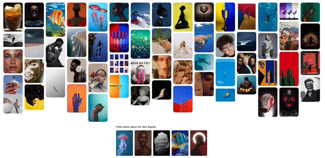
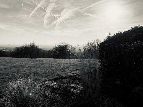
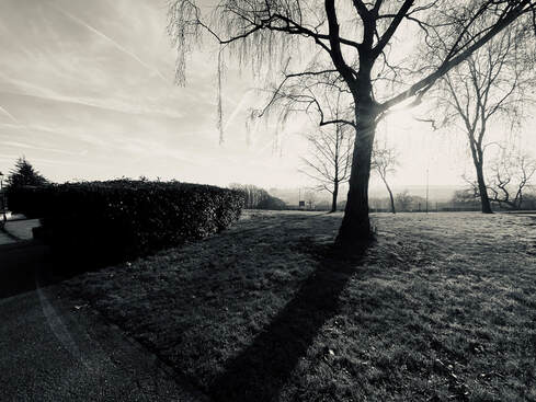
This is a Pinterest board I created of all the extreme contrasts I find cool and may be able to steal some ideas and create images of my own.
George Mayer is a photographer a designer and an artist. He uses shadows and black and white to create sharp contrasts. He uses shadows to create the colours
Concept:
Take an old fashion theme:
Meaning:
To look at classical themes in a modern way – Old fashion can be good.
Content:
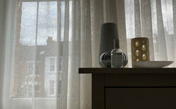
Modern pieces of design. Light in colour, but with interesting light reflectance and aptterns. Placed on table.
Location:
Internal but with view through windows as backdrop. Location not specific, but ‘ordinary’ backdrop view.
Lighting:
Natural lighting, but no direct light. Enough light levels to show texture, pattern shape of objects. Lighting/darkness to create contrast for still life objects
Composition:
5 objects (odd number) of similar tonal qualities arranged with the most height in the 1/3 rule. Using the Golden Section (basis of 1/3rd rule) arrange objects to align with the proportions of the golden section. Tallest object has smaller objects leading up.
Editing:
Rearrange components of the photograph to maintain the original feel, but make the picture difficult to read using the golden section
Take an old fashion theme:
- Still life Painting
- Third rule – adapted from the Golden Section
Meaning:
To look at classical themes in a modern way – Old fashion can be good.
Content:
Modern pieces of design. Light in colour, but with interesting light reflectance and aptterns. Placed on table.
Location:
Internal but with view through windows as backdrop. Location not specific, but ‘ordinary’ backdrop view.
Lighting:
Natural lighting, but no direct light. Enough light levels to show texture, pattern shape of objects. Lighting/darkness to create contrast for still life objects
Composition:
5 objects (odd number) of similar tonal qualities arranged with the most height in the 1/3 rule. Using the Golden Section (basis of 1/3rd rule) arrange objects to align with the proportions of the golden section. Tallest object has smaller objects leading up.
Editing:
Rearrange components of the photograph to maintain the original feel, but make the picture difficult to read using the golden section

Golden Section
Still life using Golden Section |
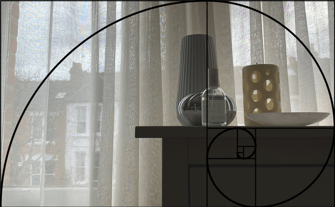
Golden Section overlay on photo |
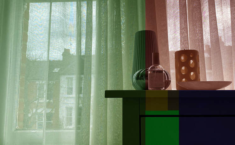
Different colour filters to demonstrate Golden Section |
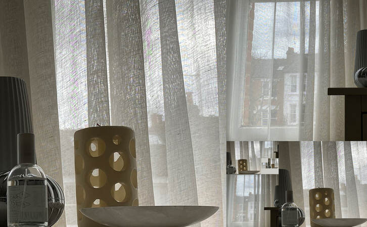
Image divided into squares and arranged using golden section, whilst keeping original feel of image |
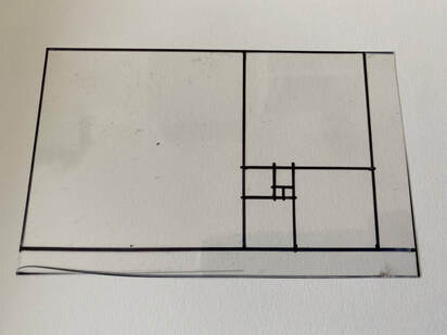
My Golden Section view finder
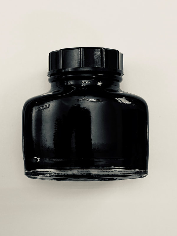
I like the colour contrast between the black ink bottle and white paper. Also like the texture of the reflective glass of the ink bottle.
|
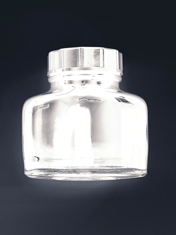
Inverting the image makes it look like an xray. this makes the ink bottle stand out
|
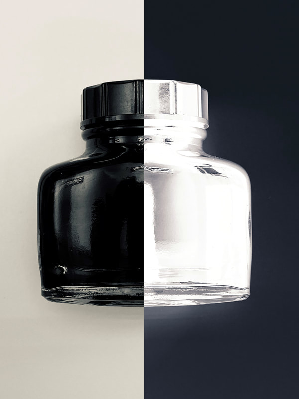
putting these two images next to each other creates a more stark contrast. the white and black go very well together.
|
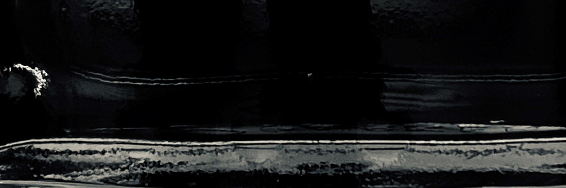
Part of the glass ink bottle - looks like a lunar landscape. it makes the viewer question what it actually is they are looking at and lets their mind wonder. The contrast between the simple colours stand out.
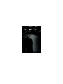
Interesting parts of the ink bottle. putting the white background creates contrast between the two colours.
|
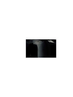
Interesting parts of the ink bottle.
|
Contrast view using 1/3rd rule |
Contrast view using 1/3rd rule |
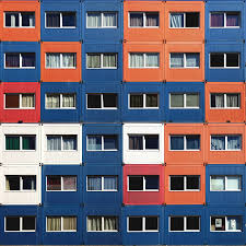
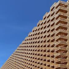
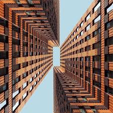
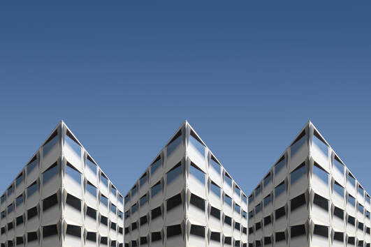
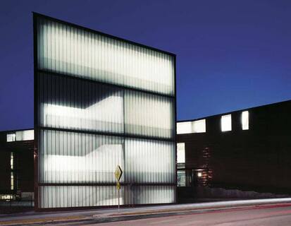
DIRK BAKKER
|
|
|
Dirk Bakker uses contrast between the colours of buildings and their shapes. He has a unique eye for lines, patterns, shadow play, and textures. Bakker also creates his own contrast of his own constructions and plays about with repetition of interesting patterns. He normally uses bright colours that attract each other. The photos he takes are taken with natural, sunny lighting.
MY PHOTOS INSPIRED BY DIRK BAKKER
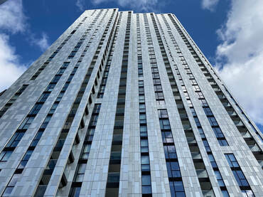
ORIGINAL PHOTO
I like the contrast of the back and white windows and shadow
I like the contrast of the back and white windows and shadow
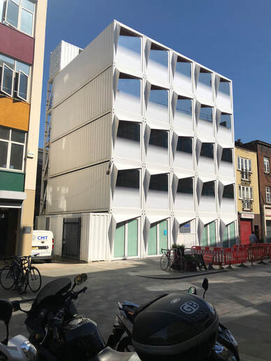
With this image I cut out the front view of the building and put it on a blue background. I changed the background so it decreases lighter gradually down the image. The negative space imitates the sky to reinforce the photoshop buildings making it more realistic.
|
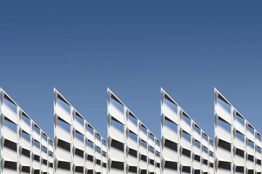
This is less of a realistic image however, the pattern of the building is flawless and makes of a more surreal image. I used the same background throughout these images.
|
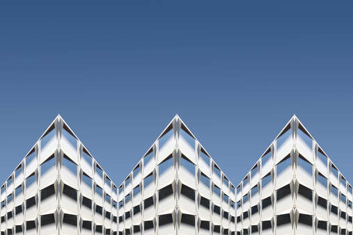
This picture is an adaptation from the second image. I added shade to every other side to make it look more realistic and more like an actual building, not a cut and cropped photo.
|
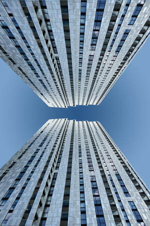
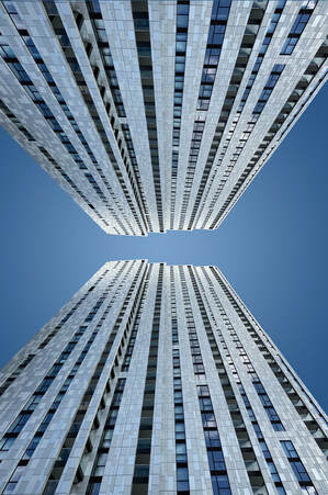
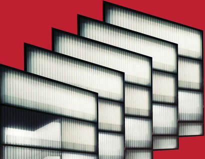
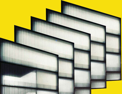
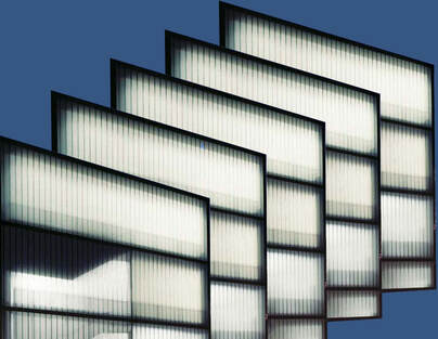
ORIGINAL PHOTO
I liked the black striped windows in contrast to the rest of the building. Also the patterning on the metal
I liked the black striped windows in contrast to the rest of the building. Also the patterning on the metal
With this image I cut out the building and reflected it top and bottom. I also did the same effect as the first images by adding a blue background so it looks more like the sky. The background, however is a darker shade i the middle. This could be improved but having it lighter in the middle like the sun and be more realistic. What I like about this image is how you look up onto the building and the lines on the object making it contrast to the plain background.
|
What i did here is an adaptation from my first image. I made it look as if the sun is coming from behind the building. As the background is blue, it matches the reflections of the windows in the building. However, for more of a contrast view, I could've done a different colour background like pink or red.
|
ORIGINAL PHOTO
I like the simple light and dark contrast.
I like the simple light and dark contrast.
|
|
|
These images are a repeat of themselves with different colour backgrounds. Firstly, I cut out the front of the building. I chose this building as it has contrast within the building and it has those bright white lights with the outlines of black lines. I then layered these pictures on top of each other making more of a surreal image. These are then placed onto a bright coloured background to give a more dynamic contrast. I like the surrealism of this image and the layers of the building.
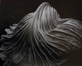
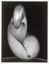
EDWARD WESTON
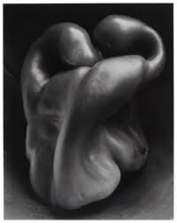
Edward Weston was a well known American photographer who was most famous for his black and white, almost unrecognisable images of vegetables such as green peppers and shells. His photos make them look like mysterious objects, with folds and rolls which at first glance make us think they are something different. I like this way of photographing an everyday natural object in a way that makes you really look at it to understand what it is. I also like the details and the flow of the shape.
|
|
MY PHOTOS INSPIRED BY EDWARD WESTON
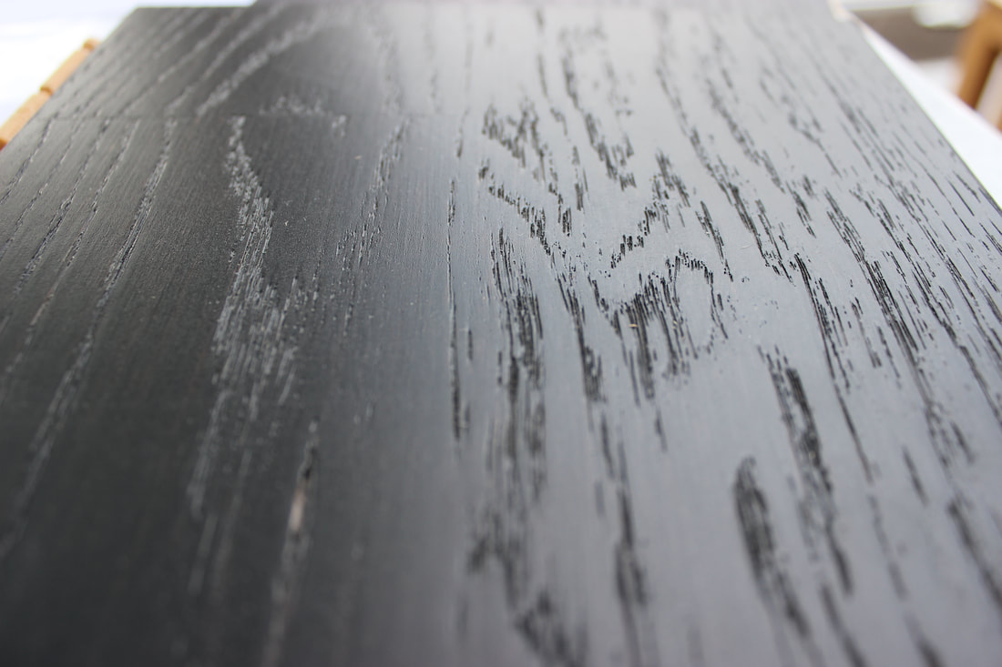
ORIGINAL PHOTO
I took a few photos of some wooden floor samples. I liked the dark wood and the way the grain has light reflecting or is a shadow, giving a contrast between the two.
I took a few photos of some wooden floor samples. I liked the dark wood and the way the grain has light reflecting or is a shadow, giving a contrast between the two.
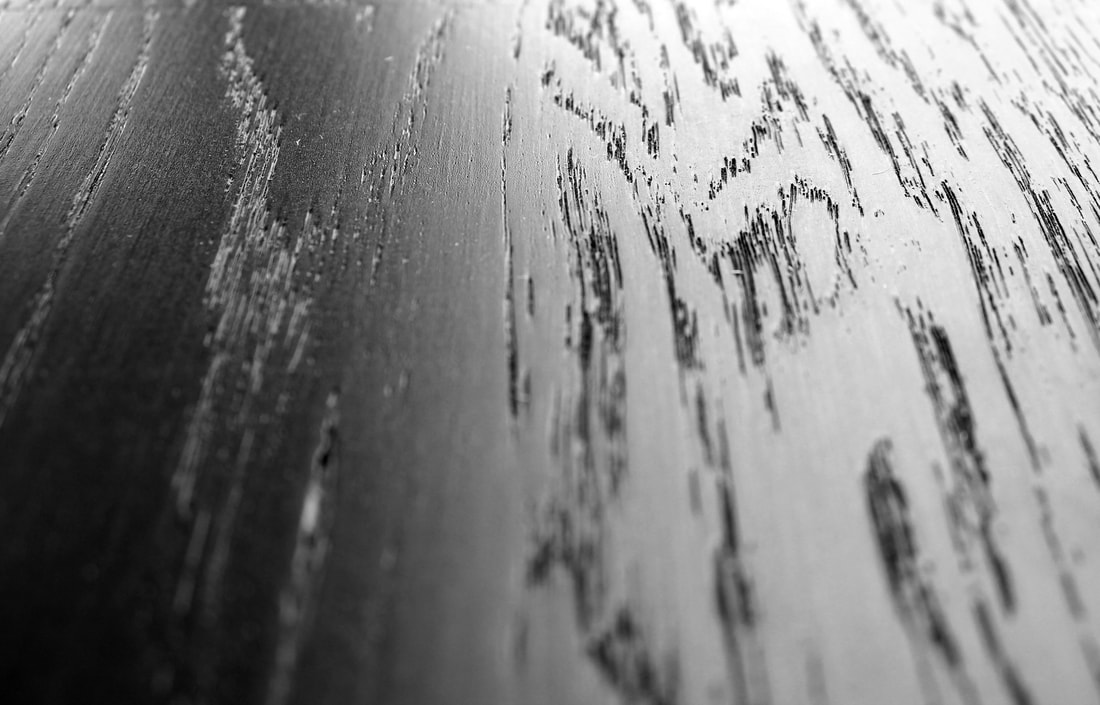
FINAL PHOTO
Because the original photo was interesting, I have only cropped the view, turned to black and white and increased the contrast.
www. I like the contrast in the way the light reflects or is in shadow on the woods texture.
ebi. This could be more abstract, possible for more contrast.
Because the original photo was interesting, I have only cropped the view, turned to black and white and increased the contrast.
www. I like the contrast in the way the light reflects or is in shadow on the woods texture.
ebi. This could be more abstract, possible for more contrast.
|
|
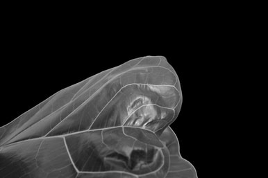
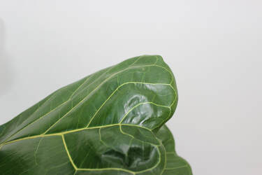
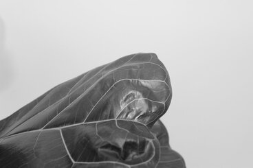
ORIGINAL PHOTO
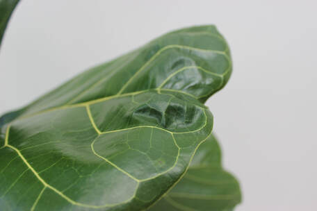
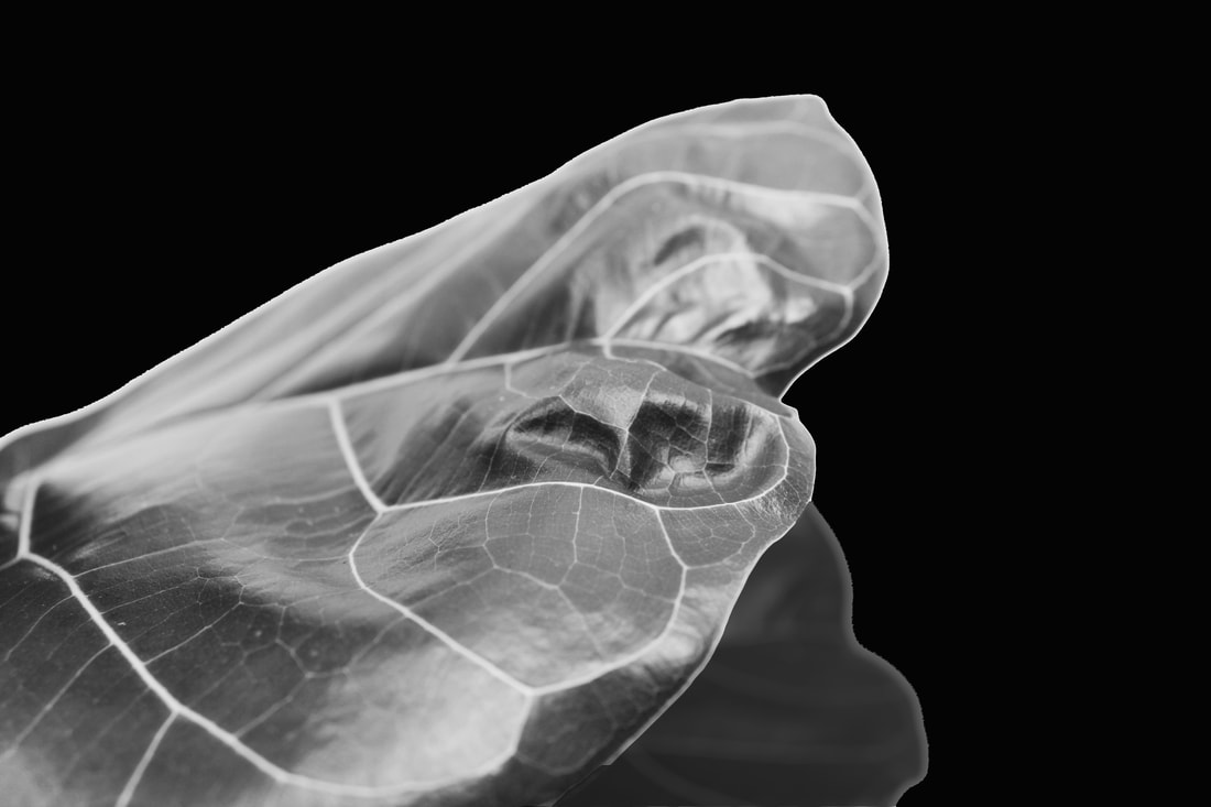
This is a photo of a house plan leaf. I liked the light reflection off the folds . This has then been changed to a B&W image and then the background turned black.
This is a photo of a house plan leaf. I liked the light reflection off the folds . This has then been changed to a B&W image and then the background turned black.
For the final image, I changed the background from black to slightly lighter so it feels more part of the photograph
www. Changing the background and the light reflecting off the folds of the leaf are a good contrast
ebi. If there was more contrast with the light areas and the photo had more depth it would look better
www. Changing the background and the light reflecting off the folds of the leaf are a good contrast
ebi. If there was more contrast with the light areas and the photo had more depth it would look better
|
|
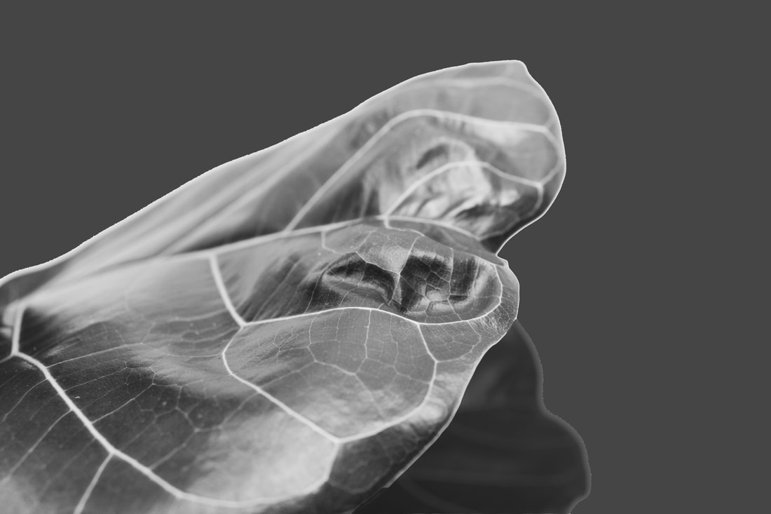
ORIGINAL PHOTO
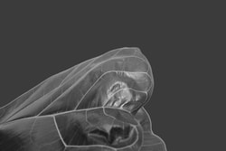
Another go with a houseplant leaf. Took original photo then created a black background and remove part of the plant that does not fit. Made the whole photo black and white. Adjusted contrast and darkened the lower part of the leaf
Another go with a houseplant leaf. Took original photo then created a black background and remove part of the plant that does not fit. Made the whole photo black and white. Adjusted contrast and darkened the lower part of the leaf
Click here to edit.
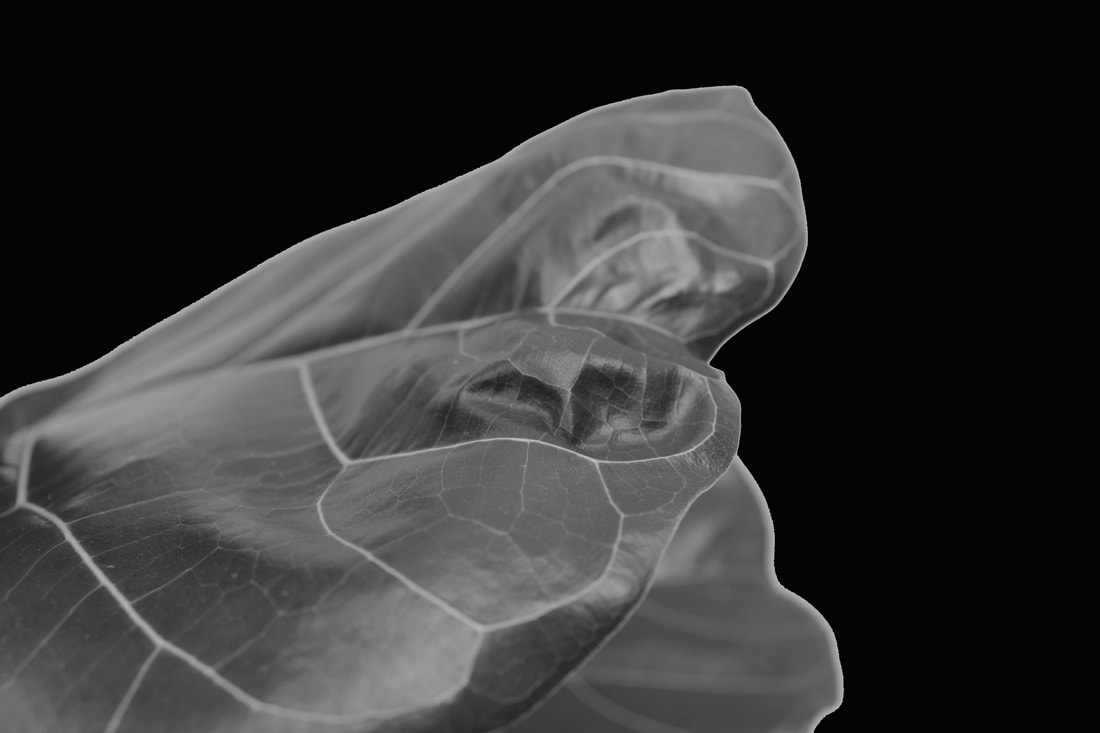
Final Photo
Have lighted the background to bring it all together
www. The contrast is better than on the other leaf photograph
ebi. There is a light line around the leaf which would be better if it were darker and create a better perspective.
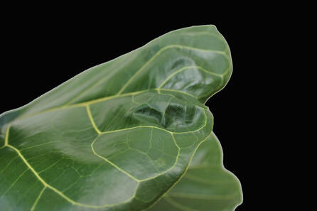
Have lighted the background to bring it all together
www. The contrast is better than on the other leaf photograph
ebi. There is a light line around the leaf which would be better if it were darker and create a better perspective.
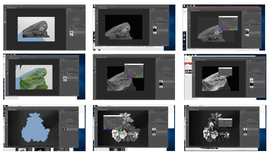
Some screen shots of the editing
ORIGINAL PHOTO
|
I changed it from its normal colour to black and white on photoshop. I did this because it links back to the photographer I'm basing my photos on. It also brings out more contrast between light and dark/ black and white.
|
FINAL PHOTOS
The flower is recognisable when you can see the whole of the flower. By cropping the view it is less recognisable. also by zooming in it does the same effect. the reason i did this is because edward westons photos are quite hard to make out what they are.
www. The texture of the leaves are interesting. look more like a flesh
ebi. It would be more interesting if the leaves were even less recognisable to make the viewer question more
|
|
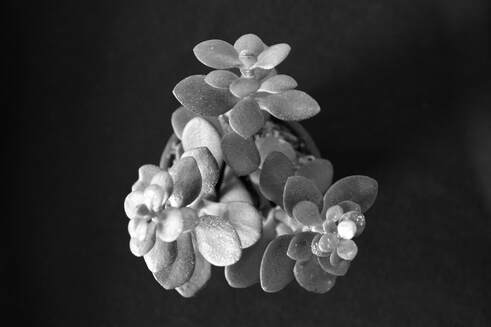
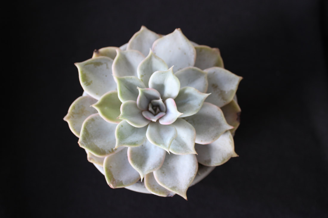
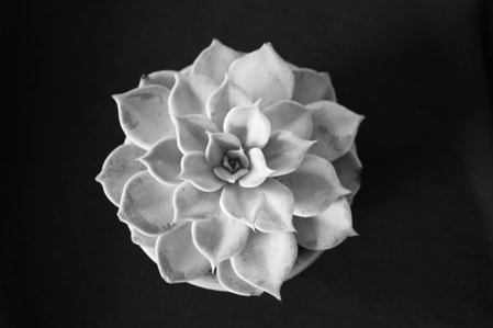
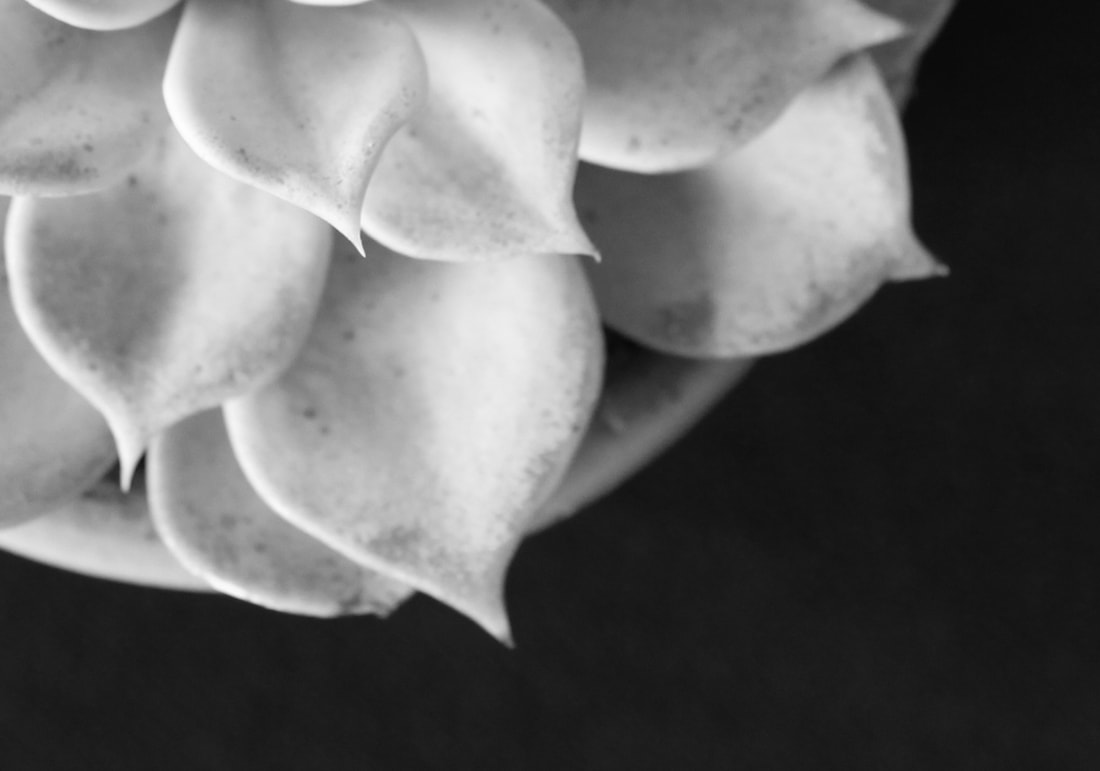
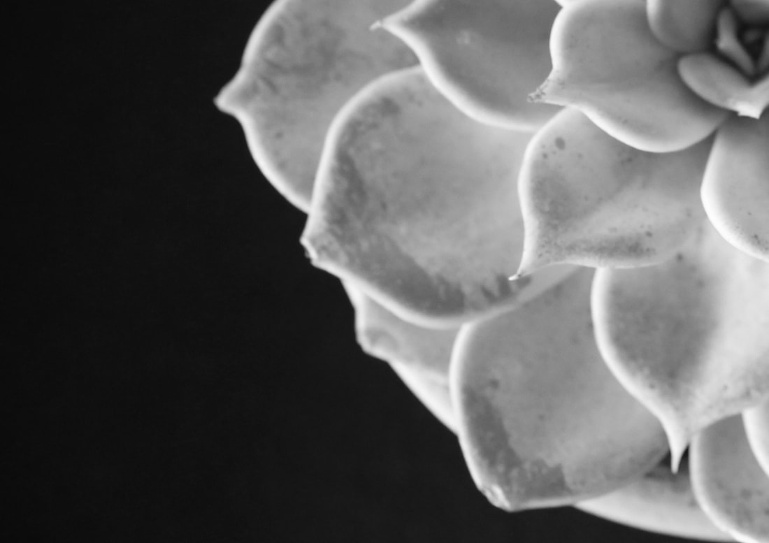
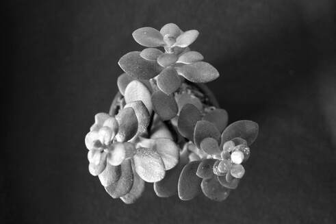
ORIGINAL PHOTO
Top view of a different cactus plant. turned to B&W and then the background darkened. I turned it black and white to create the contrast between light and dark. I prefer this as the green didn't really go well with the black background. It also links back to Edward Weston.
Top view of a different cactus plant. turned to B&W and then the background darkened. I turned it black and white to create the contrast between light and dark. I prefer this as the green didn't really go well with the black background. It also links back to Edward Weston.
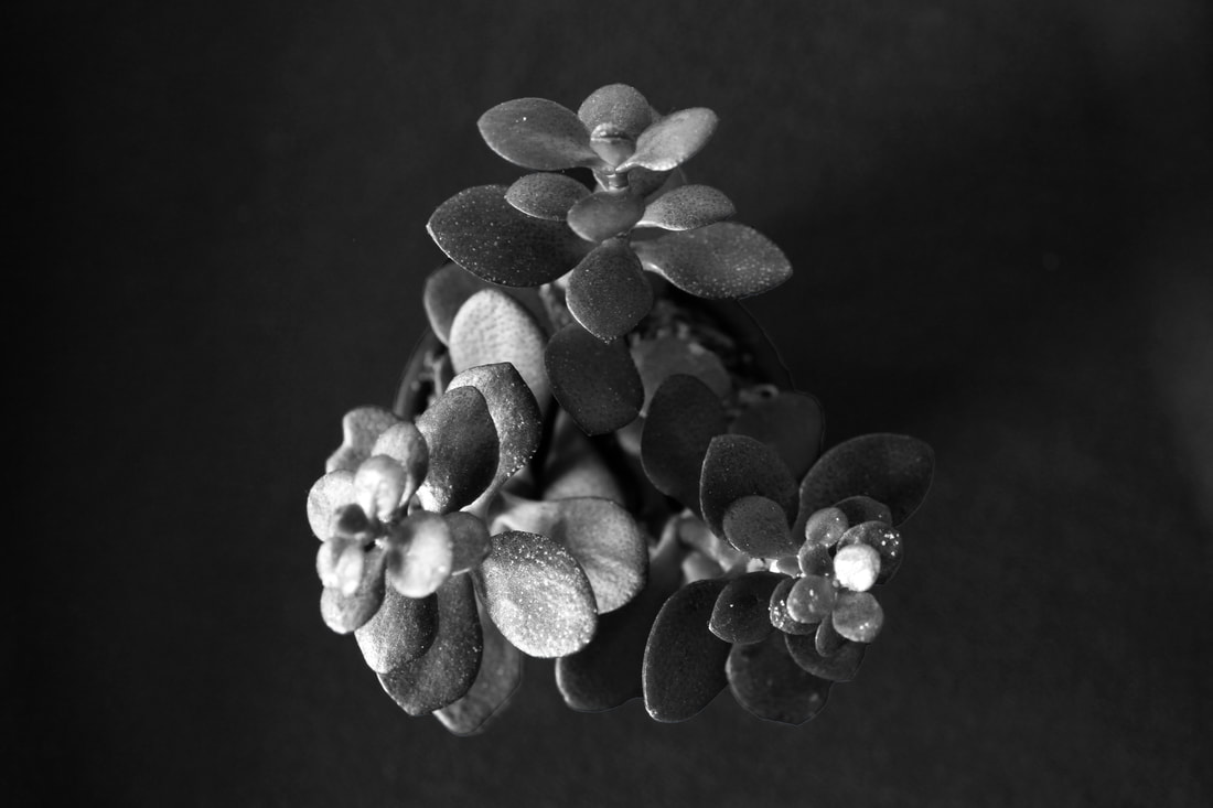
FINAL PHOTOGRAPH
Increased the contrast.
WWW. I like the way the plant is growing out of the background and is on its own - the negative space really helps the plant stand out. I also like the contrasts of the different shades of grey/white/black.
EBI. If it were less recognisable on the initial view, maybe by cropping the image it could be more like an Edward Weston. What else I could improve is where i put the focus on the flower. The top part of the flower should be more in focused, and then as you go down the plant it becomes more blurry.
my final strand
in this last strand ill be adapting from my second strand by DIRK BAKKER. I like this strand because of all the bright colours with the buildings and the contrast of them compared to the negative space in the background. what i will be improving is the actual colour of the buildings. this is because i find the colours i have already, quite boring and dull so i had to make the background more interesting. The background will also remain a light colour but less bright but in contrast to the building in front of it.
